The story of Operation Merkur
Merkur, the smallest of the TSWW games released to date, was created more or less by accident as we had to change our print solution. At the same time significant additional information relating to the Battle of Crete in 1941 was dug out of new and expanded source material, particularly relating to the Luftwaffe and the Greek forces involved.

Needing to develop a small, cheap game meant that we had 3 great reasons to do a quick, simple update to an existing (and great fun) part of an existing game as a standalone product. Thus Operation Merkur was born. Clearly, to get pricing correct, the game could not ship in a box – but the house style developed over the previous 4 years had to be maintained.
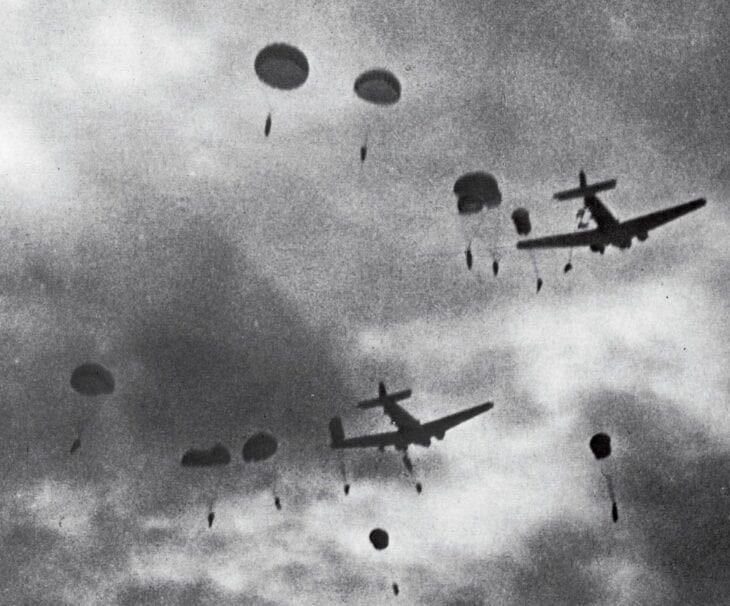
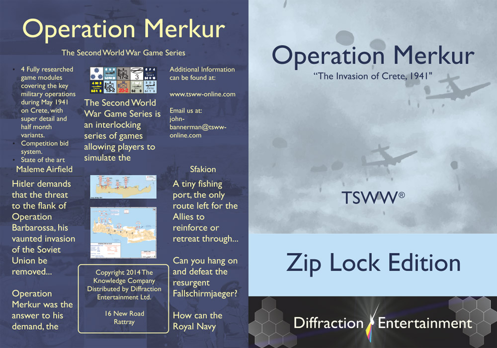
Utilising the Madagascar and Balkan Fury zip lock editions as a baseline, I decided that merkur should be a little different to the other titles, harking back to the Blitzkrieg box art in some way whilst introducing a more impressionistic feel to the art work. Fortunately there were a horde of very powerful images relating to Crete that were DRM free, so one was selected as a start point.
As you can see it’s a really atmospheric image – showing the shock of the initial drop (although I should point out that the bloke on the right was not going to make it alive as his parachute was a streamer). That said it was also a bit dour and lacking in the sort of art deco/western propaganda type feel I was trying to achieve, so the image needed a bit of processing to make it as good as it could be.
Based on the simple fact that the bulk of the fighting and casualties absorbed on the Axis side was done by General Kurt Student’s 7th Flieger Division, and that the bulk of the losses inflicted on the Royal Navy were inflicted by the Luftwaffe’s strike aircraft based on Rhodes, in Greece and on various small Islands around the Aegean, it made a great deal of sense to pick the Luftwaffe’s dress uniform blue as the base colour for the cover art.
That I love blue as a colour (it can be warm cool, sunny, shadowed and is basically very versatile) I elected to resample the image (to about 1200 dpi as I recall), then did a high quality outline trace in CMYK “grey scale”. That was then overlaid with the blue you see on the main profile and voila – we have lift off.
Multiple redos of this process plus some manual “messing” with the image were undertaken to get a suitable smoky feel to the air drop (which was, unsurprisingly given the time of year and the fact that it was on Crete, done in blazing sun shine, overlaid on burning buildings and munitions dumps on the ground, hit by multiple Luftwaffe air strikes in the days preceding the drop).
That to me looked pretty amazing, and by stealing a deep navy blue for the text on the front (always this being TSWW in our house TSWW font) from various other images I had done, the main art was “done” – and looks rather good even if I say so myself!
The DE Ltd. banner was revised at the same time, showing that wargame staple, hexes plus the by now normal light flash logo. On the back given the simplicity of the content, underlying imagery is all from the debacle (or victory) that was the battle for crete. For the first time I looked at showing map art on the back – but it did not really look right in my view so that was left for another day, and another game.
As usual our off white colouration for text was picked (this may change on the revised games as they will be made to “pop” more over time) but in general I love the tones used in this slip cover. Indeed at this time it is actually my favourite bit of zip lock art.
If I had one reservation, it would be the unfortnate choice of too light a substrate for the print job – an error never made again! Now in adequate stock, you can grab a copy of Operation Merkur from our shop.


0 Comments